A Quick-ish Accessibility Review: shadcn/ui Charts
Published
Disclaimer
I’m a neurodivergent and multiply disabled expert in web accessibility. I have a software engineering degree and almost a decade of software engineering experience. I am currently a self-employed consultant in software engineering and accessibility. (Reach out if you want to collaborate!)
This article is a few hours of free labor and close to half of what I’d charge for a 1-week sprint in a contract. This is to say I spent valuable time and limited energy doing work that should paid good money. I’m not saying it has to be me, but it should be someone with expertise in accessibility.
The Announcement
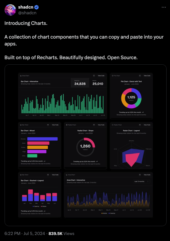
On July 5th, 2024, shadcn/ui Charts were announced on X.
The Marketing and Documentation
On the shadcn/ui home page, there’s a new Charts navigation link and an “Introducing Charts” call-to-action in the main content area.
The first links to the Charts Library page. It contains a few dozen examples of area, bar, line, pie, radar, and radial charts. There is also a widget for changing the color scheme: default, palette, sapphire, ruby, emerald, daylight, and midnight. There are no mentions of the keywords accessibility, keyboard, or screen reader.
The second links to the main Chart component documentation. It has an interactive demo and documents installation, grids, axes, tooltips, legends, theming, and other configurations.
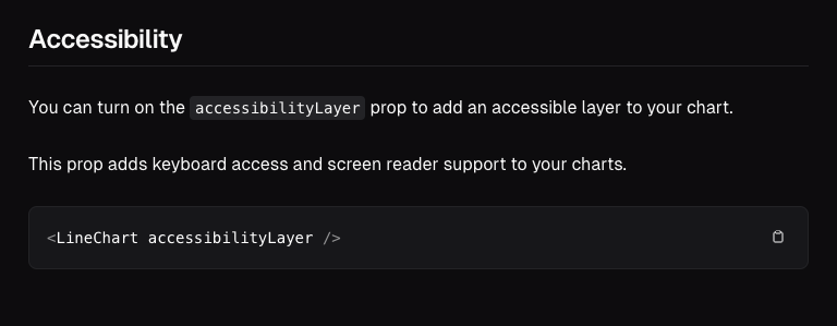
At the very end of the page is an Accessibility section. Through one boolean prop (a React term), it states the ability to add “keyboard access” and “screen reader support”. It also provides a copy-paste-able short example code snippet.
A Few Quick-ish Tests
Test 1: “Your First Chart” Documentation Demo
Video description coming soon.
Test 2: “Add a Grid” Documentation Demo
Video description coming soon.
Test 3: “Add an Axis” Documentation Demo
Video description coming soon.
Test 4: “Add Tooltip” Documentation Demo
Video description coming soon.
Test 5: “Add Legend” Documentation Demo
Video description coming soon.
Test 6: With and Without VoiceOver’s “Quick Nav” mode
Video description coming soon.
Some Accessibility Issues
- SC 1.1.1 Non-text Content (Level A): The charts tested do not have a text alternative. The only information presented by a screen reader is axis text labels and (sometimes) the tooltip content is reachable.
- SC 1.3.1 Info and Relationships (Level A): When a legend is configured, it has no directly coded relationship to the chart. Since it is placed in the DOM after the chart with
role="application"there is no inferred relationship. Tooltips are also after therole="application"element, so their content cannot be presented by screen readers without moving through the rest of the chart content. - SC 1.4.1 Use of Color (Level A): Color is currently the only way someone can visually distinguish data in the charts. I have not found documentation for how to make these charts visually accessible with strategies like monochrome palettes, line styles, pattern fills, or extra labels. The tooltips can help, but only if they represent one piece of data at a time. In the videos above, each tooltip represents two bars.
- SC 1.4.13 Content on Hover or Focus (Level AA): The tooltips can be dismissed with the ESCAPE key, but they are not hoverable or persistent. This prevents many people from perceiving and understanding the tooltip content. They may also accidentally make the tooltip disappear with the slightest cursor movement.
In Summary
In my quick-ish testing, I found multiple critical accessibility issues with the Chart component. The “keyboard access” claim in the documentation is mostly accurate. The “screen reader support” claim is false. No information is presented about the data by a screen reader when using the left or right arrow keys to navigate the charts.
The documentation also does not describe how keyboard or screen reader interactions should work, which I find irresponsible considering the bold marketing claims this library is “Accessible.”
With great popularity comes great responsibility. Web accessibility is becoming more enforced by law and expectations of UI libraries are rising. Most library consumers will take “Accessible” at face value when they trust the maintainers or referrals. Since charts are an “advanced” accessibility topic, many likely don’t know how to verify the claim.
As a person who relies on a multitude of accessibility “features” (I don’t like the term “accessibility feature” but I can’t think of an alternative), it’s discouraging to see a popular UI library miss key aspects. When the marketing says “Accessible” but neither the documentation nor the functionality backs it up, it diminishes my trust and the library’s credibility.
If the documentation demonstrated effort in it, I would believe accessibility is a priority. But based on my test results, the library’s popularity, and my lived experiences: I don’t see enough evidence to feel that accessibility is treated as seriously as it needs to be. It feels performative. I’d love for that perspective to change.
Related Resources
From the Do No Harm Guide: Centering Accessibility in Data Visualization
- Summary by Urban Institute
- Report as PDF
- Chapter 5: Coding Accessible Data Visualisations (by Léonie Watson)
- Chapter 6: Creating Better Screen Reader Experiences (by Sarah Fossheim)
From the Web Content Accessibility Guidelines 2.2
- SC 1.1.1 Non-text Content (Level A)
- SC 1.3.1 Info and Relationships (Level A)
- SC 1.4.1 Use of Color (Level A)
- SC 1.4.13 Content on Hover or Focus (Level AA)
- Understanding “Text Alternatives”