Why You Should Use px Units for margin, padding, & Other Spacing Techniques
Published
Why are CSS margin and padding so closely related?
The CSS margin and padding properties are often talked about together for two reasons:
- They both affect whitespace and sit right next to each other in the CSS Box Model, only separated by a border if one’s present.
- They accept nearly the exact same CSS data types for their values:
lengthandpercentage. (marginalso acceptsauto, but that’s not important for what we’re discussing here.)
What are the length and percentage CSS data types?
CSS length is one type of a distance value. CSS percentages are similar to length, but the difference is that they’re always a fraction of something else in a page depending on what property they’re being used with. Lengths can either be absolute or relative.
What’s the difference between absolute and relative units?
CSS provides us two types of units so we can build flexible websites that work across all kinds of devices and configurations.
- absolute length units are always the same, and not based on anything else in a page
- relative length units units can change, and are based on font and viewport
How do I know when to use absolute or relative CSS units?
Most people don’t like their questions answered with a question, but that’s how I feel like breaking this down right now. (Sorry!!)
When you’re deciding between absolute or relative CSS units for a particular CSS property, you need to think about what a user is trying to do.
You may already be familiar with relative length units when it comes to text size. It’s best practice to use rem units for the font-size property, because it enables users to customize their viewing experience with settings on their personal device.
Relative length units are also commonly used for changing how a page looks based on a user’s viewport size. It’s how we go about implementing responsive designs that will work no matter what device, window size, page zoom, or text size a user has.
So what user actions are we designing for when we use relative length units?
- Increasing text size settings
- Resizing a browser window
- Zooming in or zooming out of a page
- Reading from a mobile device
In all of these situations, what does a user care about most? The content, or the spacing between the content? Which of these two things are vital for understanding the web page?
Why shouldn’t I use relative units for margin, padding, or other spacing techniques?
When a user is customizing their viewing experience, they thing that’s most important to them and their task at hand is the content. Spacing isn’t often vital for a user to perform their task, so it doesn’t need to grow or scale at the same rate as the content itself.
When spacing between content grows, it eats up vital real estate and becomes harder to manage. You probably know the pain of horizontal spacing if you’ve worked on a site long enough to add multiple main navigation links over time. You run out of space at double the rate if you scale margin and padding exactly like text size!
In terms of vertical spacing, you also end up making a user’s task harder to complete. There’s nothing you can do about text that has to wrap to the next line based on limited horizontal space, but you don’t want to make pages even taller because your vertical spacing grows with your text size.
Tall pages mean more scrolling and work for a user that just wants to read content differently, and they’ll also be even more limited at how much content they can see at one time.
Code demo: the difference between absolute and relative units for margin and padding
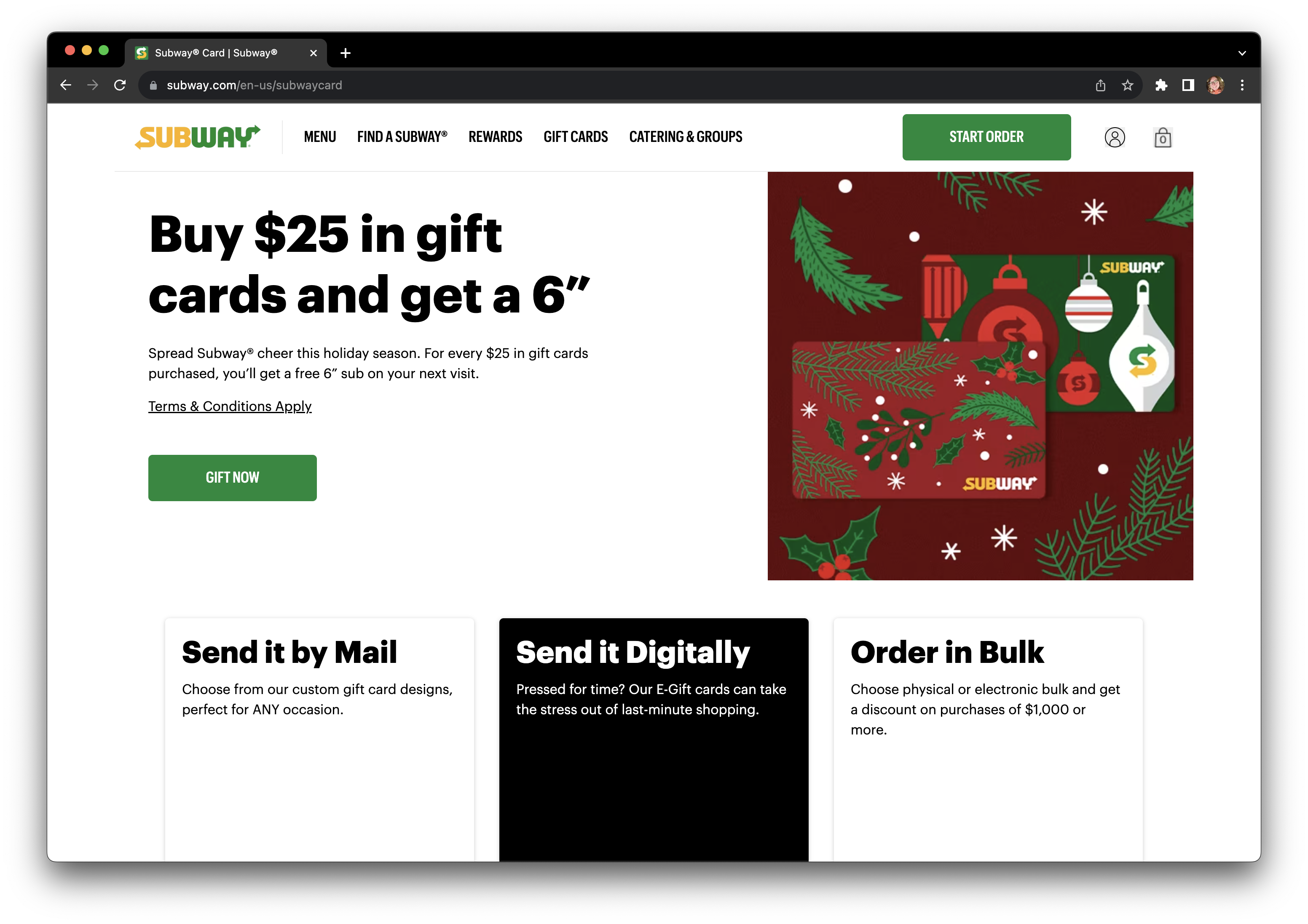
I’m going to “pick on” a page from Subway’s website because it’s the first one that came to mind where I’ve for sure experienced this issue. I don’t have anything against them or the developers that made this website! It’s just helpful to see a real world example, and it’s easier for me than to come up with my own.
Note: This demo's webpage has multiple accessibility issues.
This webpage has other issues besides using rem units for margin and padding. My goal in this demonstration is to show how this approach affects content height, and thus scrolling and readability. There are still reflow issues that occur on the page that require a little bit more code in addition to swapping rem units for px.
Before increasing text size
At the time of writing (November 2nd, 2023), here’s the basic view of one page without increasing text size. At a high level, it has:
- a navigation header with the logo, multiple links, and a few buttons
- a two-column call to action with large text, a description, button, and a Christmas themed graphic
- a three-column breakdown with additional information about the product being sold on the page
After increasing text size
To test what happens with only a text size increase, I can add one CSS property to the main <html> element on the page: font-size: 200%;. This works by doubling whatever base font size the website is using, and because they use rem units for actually sizing text.
Related WCAG: Success Criteria 1.4.4 Resize Text and 1.4.10 Reflow
Curious about this font-size: 200%; approach? I break down the WCAG requirements related to text resize and this testing approach in a separate post.
👉🏻 Set yourself up for text-size success with one of my favorite custom bookmarklets: An Accessibility Bookmarklet for Testing 200% Text Size
Unfortunately, they also use rem units for margin and padding in most elements. In the next screen recording, we can see that:
- The navigation header is now extremely tall, taking up almost half of the window height and also covering up the next section of content.
- Less than half of the navigation header content is visible, because most of it is overflowing off the righthand side of the window.
- The two-column call to action section is still two columns, not leaving much horizontal space for all the text it has.
- Within the text column of the call to action section, the space around the text is larger, leaving even less horizontal space to read it. The large text is showing about one word per line, and the smaller text is only showing a couple words per line.
After updating to px units
To show what this webpage would look like if it used px units for margin and padding instead of rem units, I inspected the HTML and CSS using my browser devtools and overwrote some of the CSS values. As we can see in the next screen recording:
- The navigation header still has content cut off to the right but it’s much shorter, meaning we have more space to see the main content on the page.
- Since we can see more content at once on the page, the content is easier to understand because there’s more immediate context to get information from while reading.
- In what was the two-column call-to-action, I adjusted the padding around and between groups of text to no longer scale, giving more horizontal space to show the text.
- I also made the two-column call-to-action just one column to decrease the height of the text portion. This demonstrates a large benefit of making the media query for this section use
remunits rather thanpxunits (article on this approach coming soon).
How else can I make my responsive design accessible?
It’s your lucky day! I’ve been working on an informal series about accessible responsive design.
- Recently posted: Don’t Use Fixed CSS height or width on Buttons, Links, or Any Other Text Containers
- Currently in-progress and coming soon: Why You Should Use
reminstead ofpxUnits in CSS Media Queries